Monday, November 30, 2009

Project Five :: Next steps for your font

For our next class, choose the most effective of your 3 alphabet versions, rework/improve what you've already created, and develop letterforms based on 4 words:
  • One word of your choice, related in some way to your object, at least 6 letters long.
    Set lowercase.
  • Another word of your choice, related in some way to your object, at least 6 letters long.
    Set uppercase.
  • 2 more related words, set in upper and lowercase
  •  
After reworking and creating the new letters, follow the Photoshop demo to prepare and set your words. Bring black and white printouts to our next class.


The final due, next Monday Dec 7, should consist of three fields on a board:


Monday, November 23, 2009

Project Five :: Letterform Design

Both Sections due Monday, Nov 30

Draw a 10 x 10 grid in pencil in which the units are about the same size as your objects. Each grid unit should have the same height and width. Make a few copies of your grid, some at 100%, some scaled a bit larger, some a bit smaller.

Start positioning your objects on your grids to create letterforms. Concentrate on the following letterforms: A, N, B, G, Z, n, p, i, r, k. Take digital photographs of each result, then move on to a new letterform. Take your photographs from a consistent distance away from your work, positioned directly above (90 degrees) the work. A tripod would of course give you the most consistent results.

Attempt to create consistency from letterform to letterform by setting the same baseline and x-height for each design you attempt.

Bring in 3 different typeface designs for the above letters as digital photographs. Your design process can solely consist of moving objects around and photographing, those more inclined to "thumbnail" can sketch ideas out on gridded paper to start, then photograph the objects.

Wednesday, November 18, 2009

Project Four :: Presentation Boards due Friday 11/20

Both sections please have your presentation boards done and placed on the prof desk in your studio by the end of this week so we can hang them in the gallery.

These should be opaque white paper on good quality black board. No foam core!

Monday, November 16, 2009

Project Five :: Bitmap/Analog

P5.Bitmap/Analog Font Prototype

project
Using an object of your choosing as a base unit (or 'bit'), create the prototype for an alphabetic system built from a 10 x 10 unit grid.

objectives
Investigate the architecture of bitmapped letterforms
Understand the power of the grid in creating unified, systematic design
Devise methods for integrating the analog, or methods outside the computer, into your design process for richer ideas and results.

preparation
Find a small object to use as the base unit of your font. Try to avoid perfectly round or square objects, an interestingly contoured object will provide interesting results. Also make sure it is not a one of a kind object, you will need multiples.

for our next class
Look for interesting objects! The should be relatively small (fit in your hand) to make the font construction process feasible. Bring 3 possible objects to class. Remember, you'll need multiples (15-45 depending on your design) of the object you decide to use.

Also read pages 54–59 from the Lupton book before our next class.

Wednesday, November 11, 2009

Project Four :: Presentation Boards

Please prepare 3, 12" x 18", presentation boards for final crit. 1 board should contain your best monogram (large and small) on 2,
6.5" wide x 7.5" high
, pages. One sheet should be black and white, the second in color. Choose a color that relates in some way to your element's characteristics or properties.

The other two boards should contain your 2 best spread layouts. Those pages are of course
7.5" x 7.5"
. Images and monogram for the presentation spreads can be color or black and white, your choice. If your monogram is in color, consider using the same or a related color in your title text.


Tuesday, November 10, 2009

Project Four :: Wed 11/11, Fri 11/13

Print out your best 2 spreads before class starts for a final, in class, editing round. (When working in InDesign, keying "command" + "i" will call up spell check.)

In class
  • 20 min: have 2 people read and correct your text
  • 20 min: make final corrections, package the spread going in the book, put on my CAS drop box
  • 40 min: work on photoshop layouts
  • 80 min: Dreamweaver CSS demo

Homework
  • refine photoshop layouts, post JPEGs to blogs
  • recreate designs in Dreamweaver
  • begin preparing boards for final crit (see upcoming presentation post)

Monday, November 9, 2009

Project Four :: Deliverables & Web Layouts Mon 9/9

We are now moving our typography into the internets! Many design projects involve multiple media and components. Along with our postcards and books we will have a website devoted to your elements. Sweet!

In class together
  • Collect InDesign files 
  • Export and collect PDF files
  • Monogram thumbnail demo
  • Photoshop layout demo

In class in studio
  • Layout sketches 5-10
  • Begin designing 3 layouts in photoshop:
    Size: 576 px (pixels) wide * height dependent on content, start at 800 pixels
    Typefaces: restrict typeface choices to the following cross-platform web fonts:
    Sans serif: Arial (Helvetica), Verdana, Trebuchet
    Serif: Georgia, Times New Roman
    Type siz
    e: don't go under 10pt, be generous with point size for the web!
    Color: Consider color for your images and your monogram for the web layouts. Are there colors that say something about your elements qualities?

Homework for Wed/Fri

  • Finish designing 3 layouts in photoshop.
    Save your files as JPEGs under "Save for Web" and put on my Drop Box like this:
    firstinitiallastname_layout1.jpg

Wednesday, November 4, 2009

Project Four :: Monogram EPS Files

Please give me your monograms as Illustrator EPS files by tomorrow (Thursday Nov 4).
They should be simple vector shapes and compound paths. The file should contain only the one monogram alone on a 3" x 3" document size.

Place the files on my CAS Server drop box or send it in an email.

Monday, November 2, 2009

Project Four :: Format Change & Deliverables

Because we are publishing our spreads in a book together on Lulu.com we will need to change the format to 7.5" x 7.5". That also means we will be limited to black and white only.

So today in class (Mon 11/2) pick your 3 best spreads, change the format,  and revise based on desk crit feedback. For homework digitize the 3 spreads in InDesign.

Also please make any final revisions on your monograms by our next class meeting.

Monday, October 26, 2009

Project Four :: Spread Compositions, by hand.

Please take all of your research, text and collected materials and design 5 different 2-page spreads about your element. The page format is 7" x 8" making the "spread" 14" x 8". Print out all of your elements in various sizes to use for cutting and pasting. Start out by making thumbnail sketches of different layouts, then recreate your best sketches, full-size, by-hand.

The required content is as follows:
  • monogram
  • photo/illustration
  • title
  • element name and number
  • 2 text paragraphs
  • properties list


Here's a nice image of the format:


Laying out a grid will help you organize your elements and find convenient places to align things. It can be as fine or as coarse as you want (meaning the size of the basic grid unit). The one below is 1/2". Draw out your grid in fine pencil or build it in Illustrator and print it out. If you use Illustrator, make all of your lines .25 pt and make them 50% gray so they don't get in the way of the layouts. Mine are also dashed, which you can find in the "Stroke" menu in Illustrator.


Additional Considerations
Set your titles, text, list and element name and number in the same typeface AND weight. Only alter size, tracking and leading for this round. Try a number of different sizes for your title text. Set the title in upper and lowercase, do not set it all caps.


Make copies of your 5 layouts and bring both paste-up and copies to class Wed/Fri.

Thursday, October 22, 2009

Project Four :: Printouts for Parents Day

By the end of class (Wed/Fri) please print out your best monogram as-is on a vertical letter-sized page. Put your name and the element name in Monotype Grotesque Regular, 9pt/11pt, in the lower right corner. Please make sure your monogram doesn't go beyond the prescribed area below. Wednesday's class: I moved the smaller monogram down 1", they were all too close to the large monogram. Please adjust and print out again and place them on the teacher's table in your studio.

See example below and follow it.

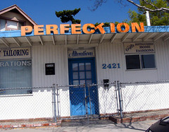
Flickr Find


Suburban Delusion
Originally uploaded by Hrant

Project Four :: Deliverables for Monday 10/26

Please do, and bring, the following to class on Monday10/26:

1. Final(?) monogram refinements

2. Read pages 62-85 (before the paragraph exercises below) and review 34-47 in the Lupton type book

3. 57(!) paragraph explorations in InDesign. This is not as much as it sounds if you are careful and thorough. Keep your page setup the same as the previous exercises, using one document for all permutations. Choose one type size and leading from the first series to start, from 9-11pt, and create the following using just 1 of your 2 paragraphs. Label each one with the typeface size and leading and the treatment you have given it.

Set your paragraph 3 times to start (mouse over the alignment icons in the "Character" window, it'll  tell you what's what):
  • left-aligned
  • centered
  • justified with last line left-aligned

With each of the above as a starting point set the paragraph in following ways:

leading/linespacing (found in the "Character" window)
  • increase leading incrementally by 1pt, 3 times
  • decrease leading incrementally by 1pt, 3 times
tracking (found in the "Character" window)

  • increase tracking incrementally by 30, 3 times
  • decrease tracking incrementally by 30, 3 times
word-spacing (find under the "Paragraph" window, in the extra menu, under "Justification")

  • increase word-spacing incrementally by 50%, 3 times
  • decrease word-spacing incrementally by 20%, 3 times

Label each as you make it. An example of a correct label would look something like this: 
Trade Gothic Regular, Justified
10pt/12pt
150% Word-spacing

or


Trade Gothic Regular, Centered
10pt/9pt

or

Trade Gothic Regular, Justified

10pt/12pt
-90 Tracking

Monday, October 19, 2009

Project Four :: Monogram Refinements

Based on Monday's crit, refine and iterate your monograms for Wed 10/21 & Fri 10/23. The amount is up to you but remember my example, the more you attempt, the better the end result will be. My initial astronaut helmet had around 40 attempts. The chosen direction then resulted in 55 iterations. And it's not yet finalized.

Finding the right formal configuration is always a process of trial, error, and discovery. Good luck.

Project Four :: Paragraph Layouts

Setting text in InDesign
For our next class set the text for your self-authored element content in InDesign. Set up a 7"w x 8"h document with no facing pages. Give the page a 3/4" border. Make a small text box at the bottom of the page (in the bottom margin, left-aligned with the paragraphs) to mark what typeface, weight/style, size and leading you are using. Set your content in 4 different typefaces, 2 sans-serif, 2 serif. Only use the "Regular" or "Roman" styles, no bold, light or italic. Pick from the Font Folio package only and avoid display faces like Rosewood and Bickham Pro. Set each typeface in the following sizes and leadings (the first increment is point size, the second is leading):
  • 8pt/10pt
  • 9pt/11pt
  • 10pt/12pt
  • 11pt/13pt
  • 12pt/14pt
This will give you 20 pages total. Print them out and bring them to our next class.

Materials for the upcoming task...
THESE ARE NOT FOR THE ABOVE EXERCISES!

Make sure you have 2 well written paragraphs of text to work with as well as the list of properties. Additionally, come up with a concise statement to serve as a title, like: "Don't Mess Around with Fermium". Also find a good quality image to incorporate into your content. It can be a photo of the element (gold for example), an illustration of it's compound make-up, or another image that illustrates something profound or at least interesting about the element.

requirements for the next stage:
  • monogram
  • photo/illustration
  • title
  • element name and number
  • 2 text paragraphs
  • properties list

Wednesday, October 14, 2009

Project Four :: More Sketches! Digitization!

Wednesday10/14 and Friday 10/16 are work days. Look over your 30 sketches and pick the 10 best ideas. Revise and refine those ideas to present the last hour of class.

Homework
  • Take your 3 best ideas and create digital versions in Illustrator.
  • Design 5 variations of each direction for a total of 15 monograms. (variations can include typeface choice, stroke weight alterations, relative scale of the letters)
  • Arrange them on a horizontal 11 x 17 sheet for presentation on Monday.
  • Post to your blog.

Project 1 :: The Lost Exercise

Please find those copies of your painted letterforms and hang them up on the north wall of studio in their proper place. We will letterspace them together in class Monday 10/19. Each is a letter in one of the following words:


Monday, October 12, 2009

Project Four :: Periodically Speaking

Objectives

  • explore the potential of letterform combinations to create symbols
  • learn approaches for combining typefaces
  • learn to manipulate letterform shape
  • choose type based on thoughtful contextual justification
  • explore typographic composition on paper and screen 
  • explore stylesheets begin applying them to both print and screen layouts

Project
Create a symbol, or monogram, for an element from the periodic table of elements. The symbol will combine the two element letters into one symbol. It should visually communicate something about the physical qualities of the element. Use your symbol, images and text to create a two-page spread about your element as well as a web-page of the same content.

Research due next class

Create an 8.5 x 11-inch sheet with your name in the top right hand corner, your element name and symbol in the top left corner, and 2 well-written, 3–5 sentence paragraphs describing your element's uses and history as well as its scientific qualities (lighter than air, melts when connected to water, shiny, heavy, expensive, etc.). Also compile a list of properties on the sheet, for example its atomic number and weight, its state (gas, liquid, solid), its color. The more thorough the better! This research will fuel your creative visual search and become the content for the two-page spread and web page.

Considering your research, pick 6 typefaces from your Font Folio that could be used to represent your element, for example, would a heavy element be best represented by Futura Light or Universe 95? Pick 3 sans serif and 3 serif faces. Add a second page to your research containing examples of your element name and symbol set in your 6 typeface choices.

Sketches due next class
Create 30 sketches of possible letterform combinations using your element symbol. Sketch by hand in whatever you are comfortable in, loose sheets of paper, a moleskin, lined yellow pad, etc. Make sure you have the above research done and visible to help the sketching process.

Saturday, October 10, 2009

FIND + SHARE

Please post any links to interesting web content about typography in the comments to this post, we will view and discuss periodically in class.

Tuesday, October 6, 2009

Project Three :: Final Crit

You will not need any boards for final crit on Monday (see below). Have your animations exported as SWF files and placed in my Drop Box on the CAS server before the start of class.

Name your SWF files like this: lastname_t1p3_09.swf


You have 4 minutes to present your work and 4 minutes for feedback.
Consider the following in preparing for crit:
  • how cropping, rotation and scale have been used in your comps, sequences and animations
  • what image integration has brought to your compositions, what challenges this poses
  • what types of narrative you have created (abstract/formal vs. concrete/contextual, is it about something?, is it just formal?)
  • how your animations infer motion and present a narrative


Blog Posting and Binders
Make blog posts of the exercises leading up to the final animation including original black and white letter cropping, comps with images (only the best) and the three sequences. Make sure to get all process into your binders as well.

Cropping Compositions


Cropping Compositions with Image Integration


Sequences


Thursday, October 1, 2009

Flashy Flash Help

Outstanding senior and all-around good guy Ian Tirone is working as a tech help specialist for the department this semester. As we are deep into learning the basics of Flash, he will make himself available to help you with any issues you may come across.

He will be available on Sunday (10/4) or Tuesday (10/6) in the morning next week, from 9-12. Send him a message and he will set up a time. If you don't send him a message he cannot guarantee availability.

This means you should get a jump on developing both the demo exercises and the final animations as Ian will be out of town at the AIGA Make/Think conference later in the week.

contact ian at: iantirone@gmail.com

Project Three :: Narrative in Motion

Create a final Flash animation that sequences your letterform from one typeface into another, integrating images and text to tell us a story. When starting, concentrate on the letter animation in black and white first, when the black and white sequence is working well, move onto image and text integration.

We will have a progress crit on these Wed/Fri.


Parameters and Considerations

  • size: 600x600
  • images: 2-6 images representing your 2 ideas, color allowed
  • text: integrate the 2 words into your animation
  • length: 10-30 seconds
  • format: export as .swf and .mov file (I will demo this Wed/Fri)

image import
For image import be sure to use the File>Import>Import to Stage (or Library). Using that sequence will allow you to reimport images into your various animations without having to rebuild them.

looping considerations
An option for your animation would be to create a seamless loop, in which the end of the animation looks like the beginning. This can be a nice effect when showing the animation. If you do not want a seamless loop, for example when your animation has a clear, distinct beginning and end, you may want to end on a black or white screen that remains for a couple of seconds. This will show the viewer that the end has been reached and give a short pause before the animation starts again in the loop. Fade-in and fade-out to black will give you a nice effect for the latter loop.


Progress crit will be Wed 10.7/Fri 10.9.
Final crit will be Monday Oct 12.

Wednesday, September 30, 2009

Project Three :: Schedule

Wed 9.30/Fri: 10.2
  • in class Flash demos
  • homework: revise sequences and image integration pieces, make demos exercises!
Monday 10.5
  • in class: Flash masking demo, shape tweens
  • homework: start final animation

Wed 10.7/Fri 10.9:
  • in class: Work in studio on final animation
  • homework: finalize animation, mount static art

Monday 10.12: Final Presentation of animation, static sequence, and static image integrations

Project Three :: Flash Demo Exercises

For Monday Oct 5th, make 3 short Flash files to reiterate what we looked at during the demo. Try to recreate my examples (linked to the red text below). Each file should be 600 x 600 pixels with a frame rate of 24 (under "modify>document").

1. Crossfade: make a 400 pixel circle and a 360 pixel square with the Flash drawing tools. Turn them into symbols. Put the circle on the stage on one layer, and the square on another layer. Fade the circle out while fading in the square.

2. Motion tweens: move circles at 3 different velocities across the screen in one direction while 3 squares move in the opposite direction.

3. Stop motion: Rotate a square at a rate of 180 degrees per second (there's a trick in this one!). The timeline should have a keyframe in each frame of your Flash file.
Hint for sequential rotation: (Modify>Transform>Scale and Rotate)

Monday, September 28, 2009

Project Three :: Part Two, Sequencing

Now it's time to magically transform one of your letters into the other. Using the same techniques we explored cropping, create 8 sequential compositions which appear as if one letter moves around or through the frame and changes it's form into your second typeface.

3 Sequences

Bring 3 composition sequences to our next class. Try very different types of sequences, rotating, arcing, bouncing, sliding, walking(?), etc.
Reduce these 50%, or, 1.5" inch squares. Print them out on 11" x 17" paper, follow the guide below. Do not mount them.


Project Three :: Add Content to Crop Comps

Pick the best comps
Decide in class which of your forms from each series is the best.
Parameters are:

-dynamic use of positive and negative space
-balance of positive and negative space
-letterform legibility

Add content to your compositions
Take your chosen content words and add that content to your compositions. You will create a series of compositions placing your found images into the positive and negative parts of your comps. Based on our in-class demo, break your compositions into separate elements (with the Pathfinder tools) and integrate your images, patterns or textures by masking in Illustrator.

Make the compositions 9" x 9" (300%).
Make 4 variations of each composition. Print each on a black and white sheet of 11 x 17 paper.

Monday, September 21, 2009

Project Three :: Presenting the crop comps

Pick the best 8 cropped compositions from each typeface set for a total of 16. Put each group of compositions on separate 11" x 17" sheets of paper for next class period. Follow my guide below for placement.

Click image to enlarge.

Project Three :: A Narrative in Letterform

A Narrative in Letterform

description

Further explore the beauty and differences of letterforms through a sequence of cropping and sequencing exercises. Apply image, animation, and sound to your formal exercises to create a deeper narrative.

objectives
  • Begin to notice typography and its many forms
  • Learn letterform anatomy
  • Learn to appreciate the architecture of letterforms
  • Apply knowledge of positive and negative space to create interesting, readable, compositions
  • Learn to infer movement through sequence
  • Explore the combination of type and image
  • Explore how movement and sound support narrative

Project Three :: Part One, Cropping

Pick a lowercase letter from the following:
a b c d e f g h k m n p q r s t u v w

Then, pick two typefaces from our font list. The typefaces should have different formal characteristics but be close in stroke thickness (weight). Construct two L-shaped masks from black or white paper or board. The angles should be cleanly cut and 90°.

Crop your letter 15 different ways, making drawings of each cropping, making sure they are square. As you crop in different ways, your square will alter its size, so scale your finished crops with the photocopier to achieve a consistent size of 3 inches for all compositions. Draw with pencil first, then carefully fill in with sharpie or black ink. Attempt compelling, dynamic compositions that exemplify the potential of the form and counterform (positive/negative) inherent in the letter. Begin by creating an even balance of positive and negative space, while maintaining legibility. Each letter will present unique challenges. Your solutions should be precisely drawn and trimmed down to perfect squares.

Homework
Create 15 more sketches using the same letter in the a second typeface. At least four of the new sketches should have the same placement as the first series of croppings. This will allow you to compare differences in the design of each letterform.

Project Three :: Word Lists & Pairs, Images

Creating Content
Make a list of at least twenty objects (can also include colors, textures, and patterns) that begin with your letter. While making your list, try to pair up words that present an affinity for each other, or tell a story when combined.

Collect images, textures and patterns that represent some of your most interesting object ideas. Brainstorm on how to incorporate those into the positive and negative spaces in your composition, i.e. will the images fill the positive space of the letter, or the negative space of the composition, can you incorporate color into either the positive or negative spaces?

Publish both your word lists and word pairs to your blog this week, also include the most interesting images from your preferred word pair choices.

Monday, September 14, 2009

Project Two :: Materials for Final Book

The 9 final typographic compositions will be copied onto transparencies on the large Konica printer and then bound together with your dot compositions.

So you will need to get:

Transparency film for Color Laser Printers

This is quite expensive and should be purchased in GROUPS. The example below contains 50 sheets which cost 40 dollars.

Section 1 has 13 students and Section 2 has 11, 24 total.
5 boxes will give you 250 sheets

Divided evenly, each student could pay $8.33 , get 10 sheets each, with 10 left over in case of emergency. I will leave it up to you to organize this amongst yourselves.


Wednesday, September 9, 2009

Project Two :: Deliverables for Monday 9/14

Bring 2-3 compositions for each of your 9 words on Monday. Make copies of them and trim down to size. Do not hang them up, we will divide into groups to crit.

Project Two :: Word Composition

Word as Design Element:
aka: how design enhances & influences meaning
aka: how typographic composition enhances & influences meaning

description
Design a sequence of 9 typographic compositions based around 1 theme. Each composition is made up of one word which can be repeated and altered.

objectives
  • utilize type as elements or units of composition
  • impact, distort, mirror or enhance meaning through composition
  • combine type and image to create more meaningful composition
  • explore serendipity and "mash-ups" in composition

task
Using your 9 chosen words from VisCom project 1, you will be creating typographic compositions that should reflect or enhance the meaning of those words.

for example:


format and technique


You will be composing within a 9 in x 6 in (horizontal orientation, see below) frame. Create separate compositions for each of your 9 words. Start by drawing out your frame on a sheet of paper and then make copies of that sheet (or print out the frame from Illustrator or InDesign). Use ONLY the word as a design element. Do not use shapes, lines or any other graphic element in your compositions. Using the word sheets created in class, compose by cutting and pasting individual words. You can scale your words up or down using the copy machine. You can letterspace by cutting and moving individual letters.

format:


fonts


For these compositions pick either Adobe Monotype Grotesk or Adobe Jenson Pro. Choose just ONE of the two fonts for your series of compositions, do not mix typefaces for this project.

Tuesday, September 8, 2009

Project Two :: Wed & Fri Update

For Wed and Fri set up your InDesign files as shown in the demo but DON'T bring printouts of the file to class. Set up the word sheets in InDesign using just 1 of these 2 typefaces from our font folio:

Grotesque MT Standard (set in both "Regular" & "Bold")
or
Adobe Jenson Pro (set in both "Regular" & "Semibold")


Set your words in the following point sizes: 9pt / 15pt / 24pt
Each page should contain one word, set both in both uppercase and lowercase, in one typeface, and in one style. That means 2 pages per word.

The only printout I do want you to bring to class is 1 page with your 9 words on it, large enough to read when hung on the wall. You can set the words in one of the above typefaces.

Wednesday, September 2, 2009

Project One :: Schedule Wed & Fri

in class
  • reading quiz
  • critique letter paintings
  • InDesign mini demo
  • work in studio refining both big drawings and perfect letters

homework
  • read pages 34-47, thinking with type
  • bring printouts of your viscomm words set in InDesign ready to use in class (more requirements in a coming post)

Monday, August 31, 2009

Project One, Part Two :: Perfect Painting!

Create a perfect representation in black gouache of the letter you received in class today.

Your first step is to draw out the "scaffolding" of the letter, lightly, in pencil on your piece of bristol. By scaffolding I mean the imaginary lines used to construct letterforms; baseline, median, etc.
Draw out 2 lines to represent the baseline and median in the center of the board. The x-height of your letter must be 6" tall, each line 3" above and below the center of the board.
If your letter has them, calculate and draw out lines for the ascender or descenter height. Measure out and scale up the various important points of the letter to use on your bristol.

Sketch your letterform out in pencil, then fill in the form carefully with black gouache. If you go outside the lines don't worry, it's easy to fix! After the letter is all filled in, wait til it is dry to the touch and go back in with white gouache to correct any imperfections.

To get nice straight lines, start with a black Sharpie, paint pen, or good ink pen. Freehanding the straight lines will be a disaster, unless you're really, really good.

Here's a helpful representation (you're welcome) of what you'll be making (click for a larger image):

Sunday, August 30, 2009

Project One, Part Two :: Supplies

We will need the supplies listed below for the next part of this project. Someone can go on a supply run during class on Monday for the bristol and gouache, bring the rest.


Bristol - smooth, 19" x 24" (or thereabouts)
Buy this as a group! A pad of 20 sheets is about 20 dollars from Utrecht. Make sure it's the smooth variety. You should not need more than 1 sheet for this project, but accidents do happen.

Gouache - black and white
Buy this as a group as well! 1-2 large tubes (40ml) of each SHOULD be enough for 1 section.

Brushes and pencils
Small and medium brushes suit our needs. Pencils should not be too soft/dark.

Small containers for paint and water
You will be using black and white simultaneously so you'll need 2 separate containers for paint and 2 separate containers for water.

Friday, August 28, 2009

Readin' Reminder!

Repeating myself here, just in case you missed it below:
Read Thinking with Type book pages 7-33 by next Monday August 31 ("First class reading"), it's much less than is sounds like, lots of pictures!

Have your books purchased for all following reading assignments.

Wednesday, August 26, 2009

Project One, Part One: Drawings with Anatomy

To add a new informational layer to this phase of the project, create 2 more drawings by Monday. Incorporate labels to indicate the parts (anatomy) of your letterforms. You can start a new composition or redo one of your previous three that you believe to be compositionally and typographically engaging.

Labels can be drawn directly on your paper, be applied to a separate material and stuck on to your composition, be tied, stapled or taped to your composition. Do whatever you want! The labels should be legible when standing at around 6 feet away and should fit harmoniously into your composition.

Be aware of how your label points to its respective area and how that area is defined visually. Do you place a dotted circular line around it, a solid yellow squared frame, etc.?


Incorporate or add at least 5 labels from the list of words below:
  • baseline
  • x-height
  • median
  • cap height
  • spine
  • stroke
  • stem
  • serif
  • shoulder
  • arm
  • leg
  • ear
  • tail
  • spur
  • cross bar
  • cross stroke
  • counter
  • bowl
  • finial
  • terminal
  • apex
  • vertex
  • crotch
  • ascender
  • descender

Section 1 & Section 2
Bring your finished, labeled drawings to class on Monday, 8/31.

Monday, August 24, 2009

Your Blog Settings

Increase your number of posts per page to keep all your blog entries visible on the main blog page. You can find this by:

1. Clicking "Customize" in the top right blogger bar area.
2. Clicking the "Settings" tab.
3. Clicking the "Formatting" tab.
4. In the first form element, "Show", increase the number of posts on the main page (200 should be enough).


If you don't want search engines to find your blog, or external viewers to comment on your blog, you can hide your blog from Blogger's listing and turn off search engine capability under:
"Settings", then "Basic".

You can also change the allowed commenters under: "Settings" then "Comments".

Anatomy and Reading Scans

On the wall in your studio you will find references for type anatomy by Ellen Lupton and John Kane. I've also scanned them as well as our first class reading. All three are available in the sidebar to the right under "class documents" or by following the links below.

This week make sure to read the "Letterform Anatomy (Kane)" PDF (pages 1-7 only) and the "Letterform Anatomy (Lupton)" PDF by our next class meeting.

Read Thinking with Type book pages 7-33 by next Monday August 31 ("First class reading"), it's much less than is sounds like, lots of pictures!

Project One, Part One

Exploring Letterform

Type has Form

Create a series of large letterform drawings using the letters supplied as a visual reference. Work at a large scale using either white or brown butcher paper (freely available in the design building). You can work directly on a wall or angle your desk up high. Loosen up and engage your arm and body to sketch out your letter. You should not attempt an exact replica with tightly drawn outlines (that’s the final exercise), but try to translate the formal qualities of your letter in a new and beautiful drawing. Look closely at your letter’s stroke weights, counterforms (the negative white spaces within the letter) and overall shape. Pencil, pen, charcoal, marker or paint (or any mark making tool you'd like to explore) are all allowed (no color!), so go for it and loosen up!

Check out last year's projects...

Section 2:
Bring three drawings to class Wednesday.

Section 1:

Bring three drawings to class Friday.

IF YOU ARE USING CHARCOAL, PLEASE SPRAY-FIX YOUR WORK!

Sunday, August 23, 2009

About this Blog

This blog will contain all materials relating to class: syllabus, project descriptions, deliverables, deadlines, discussions and more. You are expected to check it regularly and comment where required.

A designer must understand the landscape he works in and should regularly insert visual research into his routine. To this end and for the enrichment of all, I expect you to contribute to the FIND + SHARE post of this blog.

As part of your process and participation grades, your activities on your own blog and this blog will be monitored, so stay active! I expect significant process steps to be posted to your blogs and commented on.

Required Book

Please get Thinking with Type, by Ellen Lupton. This will be your required book for both Type 1 and 2 classes. Available in the school art store and Amazon.

Required Blog

To become a bloggy blogger follow these simple steps:

1. Go to: http://www.blogger.com
2. Click "Create your blog now"
3. Fill out "Create a Google Account"
4. Pick your blog name and address and click "Continue"
5. Choose a template and start blogging!


Paste your blog address (and name so I know who's who) in the comments to this post.

Required Font Package

I can't stress enough what a great deal this is for students, full access to 500 fonts in 25 font families all in Open Type format!

The Adobe Font Folio Education Essentials package can be found and purchased online here: http://www.adobe.com/education/products/fontfolioeducationessentials